After importing the finished .avi file in Premiere it was time to complete the edit, with countdown, fades and music. I searched through my collection and came up with songs that I felt were not too obvious but definitely had a wedding feel to them. My first selection was ‘Love is in the Air’ by John Paul Young, a great song that I have heard played at a lot of weddings and for me was the perfect choice. A bit of careful editing over the camera shutter ‘click’ I added gave a fairly unnoticeable edit which cut a four minute song down to thirty seconds.
For Ident 2, the church I decided to make the soundtrack more atmospheric, so created a mix of a traditional wedding song, ‘Going to the Chapel’, which faded in and out over a peal of bells (actually from Westminster Abbey – if you’re going to add SFX, add the best!)
Monday, 3 December 2007
Rendering for Video.
I had real issues with the quality of the final .avi file, which on render seemed very clear, but on playback was full of smearing and artefacts reminiscent of 16 bit colour processing rather than 24 bit. Even upping the Cinepak quality threshold to 100% made little difference, before I realised that on quick movement (especially the church Ident) I had to render the files uncompressed or at the least to DV Video standard. The results were startling in the amount of clarity, which makes me wonder Max would use the Radius Cinepak Codec as the default for .avi rendering? Like so many aspects of the programme, it does not seem to follow a logical layout.
Creating Ident Two: The Church.
 For the second Ident I wanted to retain the main wedding couple, as they were to be the corporate characters throughout the campaign. Having used a wedding cake for the first Ident, I asked people what they thought of when I mentioned the word wedding, and church came out top, so that was what I decided to build next. Again, it was made up of simple shapes, but this time I wanted to employ a more photorealistic model, so sourced real materials including tiles, stained glass windows and a church door, which I made more realistic by adding the ‘bump’ effect, pushing the clock up to 450 to give the object a real 3D embossed feel. The UVW mapping was invaluable for creating the correct perspective of the object such as the tiles.
It was easier to merge the characters this time, and I had also gone back to the original characters and added all the correct materials to them, so the whole process was becoming smoother and quicker.
Again, moving the camera by manually setting keyframes made the camera more interesting and less unpredictable!
 I also realised that the shows feature had been turned off on the lights, and although it wasn’t important in Ident 1, I needed to give the wedding characters weight as they were standing outside the church. After playing with the shadow, I added a low-key spot onto the couple and selected the ray-trace feature & didn’t think any more of it. That was until I came to render the sequence, and the computer ground to a halt! It took a lot of back tracking before I finally realised that the ray-trace was the problem, and after changing the shadow back to normal, everything started working smoothly again. Phew!
Again, I carefully chose a background that suited the piece, and a blue sky with fluffy white clouds seemed to perfectly encapsulate the ideal English wedding day.
Things learnt from Ident 2: Bump mapping of materials, UVW mapping of materials, Boolean for windows, shadow mapping and the dangers of ray-trace shadows!
Making the first Ident.
 Now I had all the elements I needed for the first Ident, it was time to create my first animation. I had decided that I wanted to make the whole sequence in one go, rather than build it up with different elements edited together in Premiere. So most importantly was the positioning of all the objects. I started with the cake & table, added the smaller versions of the man & woman on top of the cake by merging in the files. This is when I encountered my first problem – suddenly there were duplicates of body parts all over, and although Max automatically re-named them, when trying to select a particular dummy or point it was almost impossible from a huge selection list!
So I had to go back to the masters and carefully re-name them with a man / woman prefix and group any abject that didn’t need separate movement, reducing each figure to four elements: Head, Body & two dummies for the arms. This made selecting much simpler when I created the new composite of all the elements.
 Pleasing discovery: One thing I was delighted to find was that the light also came in with the characters and didn’t seem to conflict with other objects inserted. Not sure if this was luck, but it meant I was able to keep the creating modelling lighting I had employed in the cake with all the other characters complimenting it!
For the reveal to work, the larger characters have to appear quickly as the camera pulls away from the ‘cake’ couple, so when setting up the camera I selected a wide 20mm lens. This would give a feeling a depth and speed without adding too much of a fish-eye effect.
Animating the Camera.
This is something I had had problems with in the past. The Auto key function is a blessing and a curse, as it seems to record every movement, including the mistakes, and I couldn’t figure out a way to edit it. Again, being used to the key-frame ‘tweening’ principal of Adobe Premiere and Flash was totally different in Max. However I managed to get a good smooth tracking shot that looked effective using the Set Key function rather than the auto function. I learnt how move the keyframes along the timeline, both singularly and in groups to add extra time to the beginning of the sequence, and also how to extend the running time of the whole sequence. I loved the real time preview to accurately test the timing, which is a definite advantage over programmes like Adobe After Effects which needs to render its previews.
The main way of working I learnt was that each individual element or object has its own sequence of keyframes, and it is important to make sure the right object is highlighted before key-framing; otherwise the effect can be quite perturbing!
I also quickly realised that the window size I had set up in the main project was not the actual final rendered 768 x 576 pal frame, so the most important thing I learnt was to re-size the preview camera window to reflect the final render and NOT TO RE-SIZE IT!!! Once that was achieved, life was a lot easier!
I had problems with the end wedding. TV logo. I had mapped it onto a plane, which I keyframed quickly over the closed shutter. The problem was there was no real illumination to keep it looking flat and white, and if I positioned an additional light bright enough to illuminate the sign, it bled through to the main composition and over-exposed the shutter blades. The work-around: Create a flat colour and export it as a series of frames (11 in total) which I then imported into Photoshop, cut out and saved as a sequence I could import into Premiere and overlay into the sequence. With that done, I realised that I could also re-use the shutter animation in subsequent Idents and so did not need to re-merge it again. Nice!
However, when I rendered the sequence, I noticed that the standard shading I had added to the characters made them look a bit ‘flat’, so I source my records and found pictures from wedding, and from them I took out skin, red satin, jacket cloth and wedding dress ivory silk which I mapped onto the characters. The overall effect made a huge difference with what was a little effort, so I was delighted.
When I looked at the final sequence, something didn’t look right, and I concluded it was the background, which was a simple Colour gradient I had created in Photoshop. I explored the Max materials library and found a lovely sunset which really seemed to fit in with the overall sequence and really brought all the elements together superbly.
 Things Learnt from Ident 1: Merging characters from other projects. Camera tracking and manual positioning. Importance of backgrounds.
Things needed to be revised: Self illumination of objects. Keyframing lights to become brighter and duller.
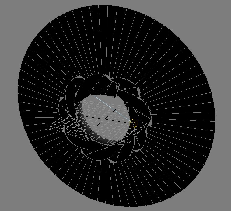
Building the Camera Shutter.

I knew this was going to be complicated, as I knew roughly how the shutter on a camera worked, but wasn’t sure how I would get everything to work at the same time! I even considered cheating and went onto Turbosquid.com to search for one, and there was one very elaborate model which looked beautiful, but cost $80! However, I was able to download the promo still from it to use as a template, and by adding it as a material on a plane I was able to trace the basic shutter shape, extrude it and with Lara’s help found out how to Boleen a hole for the joint to be added. I ten copied the shutter nine times and positioned it in a circle, which looked pretty good. It was a lot simpler than the commercial model, but as I was only going to show the centre aperture, it was fine. A nice metallic material made it look very professional.
 Moving the Shutter: Now came the big problem, making the blades rotate in the right place. Again, this is where I found Max infuriating, as noting seems to be easily placed. In Photoshop it is a simple case of dragging the anchor point to where you want, but Max there was nothing. Much searching though the help files finally revealed the pivot point change in the hierarchy section. Why there? Madness! Still, once I found it, it was a pretty straightforward to move the points, and then by chance I found while accidentally highlighting more than one shutter by mistake that the rotation edit worked universally on anything highlighted – fantastic! So closing the whole shutter was a simple task, with a few minor tweaks to make sure the iris was completely closed on the end position.
 Learnt from modelling the shutter: Line tracing a picture. Boleen cutting, re-positioning pivot points, simultaneously rotating multiple objects.
Building my woman!
 After finally creating my wedding man satisfactorily it was time to make his wife. I copied the figure to a new project and began adapting.
The Dress: This proved to be a huge challenge, more complicated than I first thought, and although the end result was satisfactory, I would like to practice more to get the effect more fluid. The first difference I found was the colour: the black suit of the man hid a multitude of sins in the final render, and creating him with simple objects (spheres, cylinders, oil tank, etc) worked well as the shaped naturally blended together. However, the white really showed up the joins, so I used this to my advantage by stylizing the dress, making the shoulder spheres more pronounced to create stylized shoulder pads, which looked very effective, if a little 1980’s!
However, the bust posed a different problem, and whereas the shoulders looked good, adding two white spheres as boobs looked ridiculous! The main dress had been easy to adapt with the scale adaptor and I hoped the vertex modelling would be the same. So I had to model the dress with the vertices, the first time I had really tried this. I used soft-selection to get an even ‘bump’, and the effect was OK, but not as smooth as I really wanted. I tied adding a turbo smooth, but although this improved the effect, it was still not perfect.
 The Hair: This had been a challenge on the wedding man, and I had created a good luck more through luck than judgement, with the hat helping to hide any raggedness, but with the woman I didn’t have that luxury, as it was all on display. I began with a sphere which I then tried to adapt and it was difficult! However, the effect was again passable, but it is something I will definitely work on further in the future.
Render problems: When I rendered the picture, the hair was invisible, even though there was a back! This was really perplexing and I trawled though the various menus looking for an answer, even enlisting the help of Alan Hopkins who had the same problem. Then I saw it, in the render options: Force 2-sided render. That was it, and everything worked fine. I have to say that I’m finding Max really frustrating with so many options that do not seem to been a logical place, or follow the same logic as the Adobe products that I am used to working with.
Lessons learnt from modelling the woman: Vertex manipulation, rendering options.
Building the Wedding Man Character.
Learning how to Cut: I had really had problems trying to model the man’s jacket. I’d searched out tutorials for cloth and tried unsuccessfully to apply them to my figure. The main challenge I had was by using simple object to create the body was editing them. I tried various ways for days, before realising I just couldn’t get the effect I wanted.
 Fortunately, the lesson this week proved invaluable, when Joe showed me the cut function, and suddenly everything was possible! From that I was able to cut a shape to show the shirt and sculpt the collar.
Collar Problems: It wasn’t till I tried to sculpt the collar I realised that my 2D perspective was totally wrong in 3D, so quickly I went to the internet to download jacket pictures to examine how the collar surrounds the neck and turns into the lapels. Interesting, 3D thinking is a totally new way of working!
So finally my wedding man was finished, boned to move his arms and looked pretty good. Now all I had to do was copy him and adapt him to make his bride. Easy – or so I thought!
Lesson learnt from modelling the man:  Boning, adding dummies, the cut & extrude function.
 Boning, adding dummies, the cut & extrude function.
Thursday, 15 November 2007
Problems Problems...
 I am really struggling to put what I want into practice. Looking at the wedding man icing figure, the coat is quite easy to wrap around the body, but recreating it in Max is proving to be a real nightmare. It should be easy, it probably is, but I just cant figure it out. Downloaded a cloth tutorial, but my results were just HORRIBLE! I also tried adding a biped to the figire and everything started going wrong. All in all a disaster. So in the end decided that only the arms will move, so I am happy that it won't affect the animation needed for the idents, but unhappy that I wasn't able to figure ot how to add the whole thing.
 ALSO manipulating shapes as editable polys is also turning into a real problem. See below my aborted efforts at ahand. I realy need some help to get this finished in time to the level that I will be satisfied with. Don't want to end up with a half-arsed job. Need to speak to you Joe on Monday!
Saturday, 10 November 2007
Playing with Max
 Playing with Max
I must admit I am a novice at 3D Max, so this week realising how quickly the end of semester is looming I sat down and worked through some of the tutorials in Max 9, and it was a real eye-opener. Firstly the range of possibilities is enormous, but secondly, how the heck can someone learn all the different hidden menus! The bouncing ball tutorial had me opening up sub-boxes to show different things that I would never have ever found on my own. The layout of the programme is definitely NOT HCI friendly!
 Still, it gave the confidence to explore different shapes, and was delighted when I started playing with the Extended Primitives in the create section. It made modelling the cake, and the table much easier than anticipated with better than anticipated results! I am especially pleased with the use of the ChamferCyl for the table, which makes it look as though it has a pleated edge, very much like a lot of table cloths found at weddings.
Monday, 5 November 2007
Things are not all they seem!


These are a couple of the margritte paintings that inspired me for the sunject ina subject - really clever stuff!
Camera Moves
Think I've finally got the camera moves sussed. I've been having terrible trouble getting the camera to move smoothly, as every mistake I made moving it has resulted in the camera following the mistakes on the final animation. Think I've got it sussed - no more auto! This is keyframes made by using the set key & key 'key' at starting and closing point. I had avoided the circle on the initial mapping, but on the animation it went through it, so the computer had worked out the most direct tween, so just needed to add an additional keyframe at frame 40 and I had a controllable camera. This is a real breakthrough for me and SOOOO EXCITING! lol
Friday, 26 October 2007
First Try at Boned Animation
First real try at animation & using bones. Very exciting indeed! After many failed attempts grasped the concept of adding the dummies to the joins, not the actual bones and everything started to work! Found that using the IK Limb command to make the original bone structure was a good way to start, and then add the IKHI Solver to where specfic joints should move. This meant the snake could have fluid movement with just 3 IKHI Solvers at top, middle and end. I think I need to play a lot more with animation, but the basics are there and I'm confident i can animate my charaters arms OK, which is the only real movement they need to make.
Modelling the characters

The basic characters will be the same, differences being hair and clothes. This is my first attempt at a head. The hair proved to be much more difficult to sculpt than I imaginged!
2nd ident idea

After chatting to Jo I examined the concept of the picture within a picture, scene within a scene concept similar to many Margritte paintings such as 'La Condition Humaine' The original wedding couple will reveal to be replicas on a cake before the photo is taken.
Monday, 15 October 2007

Sunday, 14 October 2007
Ideas for the ident

Been thinking hard about the rght ident for the piece. Have been watching a lot of the TV idents, especially BBC2 & 3 which fits my perception of the use I'm going to put my characters to rather than the graphical (and extremely clever) idents of BBC4.
I want to utilize the 3D Max elements as much as possible to give a real sense of depth and fluidity, again taking the BBC2 '2' logo & 3 static charter idents and making their environment much more dynamic, without the filmic qualities that BBC2 are currently employing.
So, here's the first idea. Now all I have to do is decided whether to adapt the current idea into three similar pieces to retain continuity and corporate identity, or to make each one radically different. From looking at all the current and recent past idents, the former, continuity, seems to be the way to adopt.
Monday, 8 October 2007
Choosing the ident
.jpg)
Well, I've been looking through all the different TV stations, both mainstream and digital and I've decided the best one to tackle will be Wedding.tv, on Sky. I was at a wedding and saw a great decorative couple on top of a wedding cake that could be ideal for a staion ident, rather like the little orange man blob people on BBC3. Now all I have to do is think of three interesting ways to animate them!
Monday, 1 October 2007
Max Spider

First play at 3D Max - very exciting. Using the extrude tools, not quite mastered them yet, so made the sider in classic joining the bits together. Looks pretty cool. Jo showed me bones & skinning - that's the way to go - will explore that further - will look good with the animated wedding people I'm planning to use for the idents. Tom showed me the hair effect - very exciting but does take a while to render. Hopefully this can only get better!
1st October
Spent a good weekend looking at idents and logos. With all the digital channels around there is so much to choose from. Noticed how the use of CGI has expanded the variety and versitility of the idents around, although there is a definate minority backlash for both kitch and simplistic designs - interesting!
Monday, 24 September 2007
Week One - most memorable corporate ident
 ORIGINAL CHANNEL 4 IDENT
There have been many interesting corporate logos I have seen over the years, but probably one of the most memorale to me was the original Chanel 4 ident. It incorporated the rubix cube craze but what was most unusual was the plain black background. Computer animation had just started to be introduced into television and although crude was still fresh and exciting. The use of the '4', deconstructing and reconstructing was very novel and interesting. Of course, programmes like Flash can do this automatically now, but then it was an 'event'. The musical accompiament, minimilistic with its 4 notes also helped to re-inforce the starkness of the ident and therefore made it more powerful. It appeared to be like nothing else that had been adopted on television before and helped pave the way for a new and more exiting dynamic way of looking at graphical interpretations of television and corporate identities.
Subscribe to:
Comments (Atom)