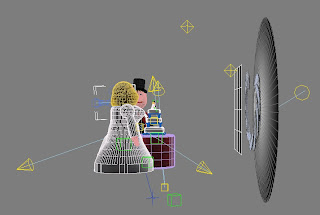
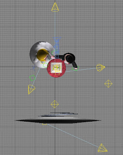
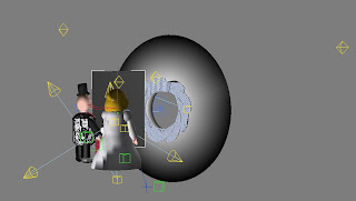
 Now I had all the elements I needed for the first Ident, it was time to create my first animation. I had decided that I wanted to make the whole sequence in one go, rather than build it up with different elements edited together in Premiere. So most importantly was the positioning of all the objects. I started with the cake & table, added the smaller versions of the man & woman on top of the cake by merging in the files. This is when I encountered my first problem – suddenly there were duplicates of body parts all over, and although Max automatically re-named them, when trying to select a particular dummy or point it was almost impossible from a huge selection list!
So I had to go back to the masters and carefully re-name them with a man / woman prefix and group any abject that didn’t need separate movement, reducing each figure to four elements: Head, Body & two dummies for the arms. This made selecting much simpler when I created the new composite of all the elements.
 Pleasing discovery: One thing I was delighted to find was that the light also came in with the characters and didn’t seem to conflict with other objects inserted. Not sure if this was luck, but it meant I was able to keep the creating modelling lighting I had employed in the cake with all the other characters complimenting it!
For the reveal to work, the larger characters have to appear quickly as the camera pulls away from the ‘cake’ couple, so when setting up the camera I selected a wide 20mm lens. This would give a feeling a depth and speed without adding too much of a fish-eye effect.
Animating the Camera.
This is something I had had problems with in the past. The Auto key function is a blessing and a curse, as it seems to record every movement, including the mistakes, and I couldn’t figure out a way to edit it. Again, being used to the key-frame ‘tweening’ principal of Adobe Premiere and Flash was totally different in Max. However I managed to get a good smooth tracking shot that looked effective using the Set Key function rather than the auto function. I learnt how move the keyframes along the timeline, both singularly and in groups to add extra time to the beginning of the sequence, and also how to extend the running time of the whole sequence. I loved the real time preview to accurately test the timing, which is a definite advantage over programmes like Adobe After Effects which needs to render its previews.
The main way of working I learnt was that each individual element or object has its own sequence of keyframes, and it is important to make sure the right object is highlighted before key-framing; otherwise the effect can be quite perturbing!
I also quickly realised that the window size I had set up in the main project was not the actual final rendered 768 x 576 pal frame, so the most important thing I learnt was to re-size the preview camera window to reflect the final render and NOT TO RE-SIZE IT!!! Once that was achieved, life was a lot easier!
I had problems with the end wedding. TV logo. I had mapped it onto a plane, which I keyframed quickly over the closed shutter. The problem was there was no real illumination to keep it looking flat and white, and if I positioned an additional light bright enough to illuminate the sign, it bled through to the main composition and over-exposed the shutter blades. The work-around: Create a flat colour and export it as a series of frames (11 in total) which I then imported into Photoshop, cut out and saved as a sequence I could import into Premiere and overlay into the sequence. With that done, I realised that I could also re-use the shutter animation in subsequent Idents and so did not need to re-merge it again. Nice!
However, when I rendered the sequence, I noticed that the standard shading I had added to the characters made them look a bit ‘flat’, so I source my records and found pictures from wedding, and from them I took out skin, red satin, jacket cloth and wedding dress ivory silk which I mapped onto the characters. The overall effect made a huge difference with what was a little effort, so I was delighted.
When I looked at the final sequence, something didn’t look right, and I concluded it was the background, which was a simple Colour gradient I had created in Photoshop. I explored the Max materials library and found a lovely sunset which really seemed to fit in with the overall sequence and really brought all the elements together superbly.
 Things Learnt from Ident 1: Merging characters from other projects. Camera tracking and manual positioning. Importance of backgrounds.
Things needed to be revised: Self illumination of objects. Keyframing lights to become brighter and duller.
No comments:
Post a Comment